Thursday, January 26, 2012

Color A Day #23 - Apricot

Apricots
Image by camknows via Flickr
Apricots are my favorite fruit.  But it's hard to come by a really good, perfectly tree-ripened apricot.  The little hard rocks often passed off as apricots in the grocery store are, well...awful.  When I see these in the market I sigh with disappointment...because I know how amazing a really good apricot CAN be.  I once bought a crate of perfectly ripened, apricots from a roadside stand near Winters, CA. They were nearly the size of tennis balls, and plucked right from the tree earlier in the day.  Heaven.  Luscious and juicy.  Perfectly sweet, and slightly tangy.  Put eating a perfectly ripe Apricot on your bucket list, people. 

Truly,  I love apricots of any type.  I buy, and eat those tiny little never-gonna-ripen-properly-cause-they-were-picked-too-soon apricots in the supermarket.  And, I love them dried.  I use apricot preserves on my pancakes instead of maple syrup.  Trader Joe's used to carry a product called Apricot Sauce (made in France).  I bought these jars full of yummy in bulk.  For some inexplicable reason, they stopped carrying it a few years back.  I cried.  Really.

But, it's mid-winter and apricots of ANY variety are a rare sight.  So, I'll just have to resort to memory - and visuals.  Here it is: Color A Day #24 - Apricot.

from Vintage Printable


Enhanced by Zemanta

Wednesday, January 25, 2012

Color A Day #23 - Necessary Yellow

Yellow.  It's one of the most basic of colors - a PRIMARY color, after all.   Remember the Sesame Street song back in the day? It was my first color mixing lesson.  Big Bird (yellow!) sang, "....just three colors; red and yellow and blue.  Enough to make a rainbow,  for me and for you!"  Great song. Excellent point.  Yellow is a vital element in the color world.
NEW YORK - NOVEMBER 09:  Sesame Street co-foun...
Image by Getty Images via @daylife

But.

I'm not drawn to it.  Doesn't excite me much.  I know it's supposed to be all sunny, and cheerful.  Warm.  Happy.  It is, I guess...but still...yellow just doesn't do it for me.  At least not all by itself.  Flat out, plain old true yellow - to me - is mostly an enhancer.  An additive element.  As in, I use it to warm up other colors that I like more.   Example: primary green is wonderfully enhanced with a little yellow added.  And blue becomes much more interesting with a touch of yellow.  And even primary yellow itself becomes so much more appealing (to me, at least), if it has a touch of some other color added to it.  A little dollop of orange or green mixed in with yellow makes it yummier.  OK.  I will admit that even if it's not my favorite color, yellow IS necessary.   So,  I'll honor this one today by making it Color A Day #23 - Necessary Yellow. 

And, tomorrow I'll use a little dab of yellow to make some color that much better.  

Yellow Florida Keys fishing paraphenalia.


Enhanced by Zemanta

Tuesday, January 24, 2012

Color A Day #22 - Cad Coral

I've mixed up a color for today.  Good start.  But, I'm feeling bereft of writing inspiration tonight.  I'm tired.  So this color will just have to speak for itself.  And I believe it does so nicely.
How do I describe this color?  Not red, not orange, not pink.  But a little of each of these.  This hue definitely has a big hit of Cadmium Red to it...but softer, lighter than Cad Red straight out of the paint tube.  Watermelon?  Maybe.  My son, trying to helpful suggested I call today's color Cranberry Orange.  Not bad, actually.  I suppose Coral might come closest to describing color #22.  So I'm calling Color A Day #22 Cad Coral.   
From Vintage Printable

Enhanced by Zemanta

Monday, January 23, 2012

Color A Day #21 - Organic Green

Today's color is inspired by The Seed, a beautiful painting by Polish Artist Pawel Jonca.
The Seed by Polish artist Pawel Jonca


That earthy, mossy, Organic Green featured in this amazing painting is the color today.  This green feels natural, homey and comforting to me.  It's a connected feeling, a connected color; connected to the earth, to growth and renewal.

English: Autumn colors reflected in Silver Cre...
Image via Wikipedia
Redwood National Park
Image via Wikipedia
I don't see much of this mossy green here in dry Southern California.  It's a color more often seen in places where it rains regularly.  Places like the Redwood Forest, and the northwestern part of the United States.  I remember taking a hike as a child at Silver Falls State Park near Corvallis, OR.  It was damp, misty,  and so very green.  It stayed in my memory; it was unlike any place I had seen as a young child, with waterfalls and drippy moss around every turn. 

My Favorite Mexican pottery mug...found in a pottery shop in Tubac, AZ
It's raining today in dry SoCal.  So I'm remembering that wet hike, and thinking about Organic Green as I sip Chai Tea in my favorite Mexican pottery mug from Tubac, AZ...a mug that just so happens to match today's color perfectly.


Enhanced by Zemanta

Sunday, January 22, 2012

Color A Day #20 - That Perfect Turquoise

There’s a particular shade of turquoise that I just love.   
It makes me smile inside when I spot it. 
Sometimes it shows up in water – like in a vase, or shimmering over sand in the Florida KeysI’ve seen it in a swimming pool when the sun is shining just right.   And of course in the semi-precious stone of the same name.  I think it’s the perfect mix of light blue with a bit of green.  

I find myself using this color often in my own paintings.  And, I’m not alone.  On a recent visit to the Norton Simon Museum I spotted this same color in Gauguin‘s painting Tahitian Woman and Boy.   “Ah!”,  I thought to myself as I admired Gauguin’s amazing color choices…”it’s that perfect turquoise!”

Detail of Gauguin's use of That Perfect Turquoise.


The Three Handed Virgin by Alisa Proctor...with that Perfect Turquoise in the background.

Friday, January 20, 2012

Color A Day #19 - Smog


 Today's color is....Smog.
English:
Image via Wikipedia

Yes, Smog.  That icky, thick layer of air that hangs over large metropolitan areas around the globe.  Nobody likes smog.  It's bad for our lungs, after all.  I live near LA.  I see the stuff on a regular basis.   I' see it anytime I fly into LAX.  Or, when heading down to the city floor after a trip to the mountains. There the layer of sludge sits.  Smog is not a sight anyone particularly appreciates.


Smog Downtown
Image by Metro Transportation Library and Archive via Flick

  But, have you ever considered the COLOR of Smog? Forget the  negative elements for a moment, and look only at the color itself.  It's really an interesting, subtle color.   A variety of taupe.  Not pink, or purple.  Not brown or tan, not altogether gray...but a combination of all those elements.  And I'm here to suggest that smog (the color, at least) is actually kind of pretty.  
by Inky Compost on Etsy

Enhanced by Zemanta

Thursday, January 19, 2012

Color A Day #18 - Bunny Eyes


Ice Blue might be a more accurate and appropriate color for today's color.  However, at some point in years ago my husband coined the term "bunny eyes" for this hue.  It's a striking pale blue...sometimes seen in dogs, and indeed,  bunnies.  And eyes like this in humans are remarkable.  (Picture Rutger Hauer or Daniel Craig....I certainly like to!)

from Berry Island on Etsy

Wednesday, January 18, 2012

Color A Day #17 - Raspberry Jam


The other day I watched a friend eat a very yummy looking Raspberry Croissant.  As she tore into it, the lush purple-red contents dribbled out.  The color of that raspberry filling has stuck with me…nagging me….as if to say, “Make me your color today!”.   But, other color inspiration intruded over the ensuing days, and I put off picking that luscious color as the color of the day.  Until now.  So, here today is that insistent Raspberry Jam.

Tuesday, January 17, 2012

Color A Day #16 - Spectacular Sky

Sometimes we forget about the sky.  We forget how astonishingly blue it can be.  And then, when you catch sight of it, and it takes your breath away with it's brilliance.  And if there are clouds, that blue can look even more intense as your eye compares it to the puffy white.   And, if one is off in the wide open wilderness, or on the open ocean, it hits you how BIG the sky is.  And how beautiful.  My recent trip to Joshua Tree reminded me of this; the sky was spectacular.    These photos are an example...this is un-retouched - no photoshop here.  Just straight-up Spectacular Sky.


Monday, January 16, 2012

Color A Day #15 - Mojave Gray

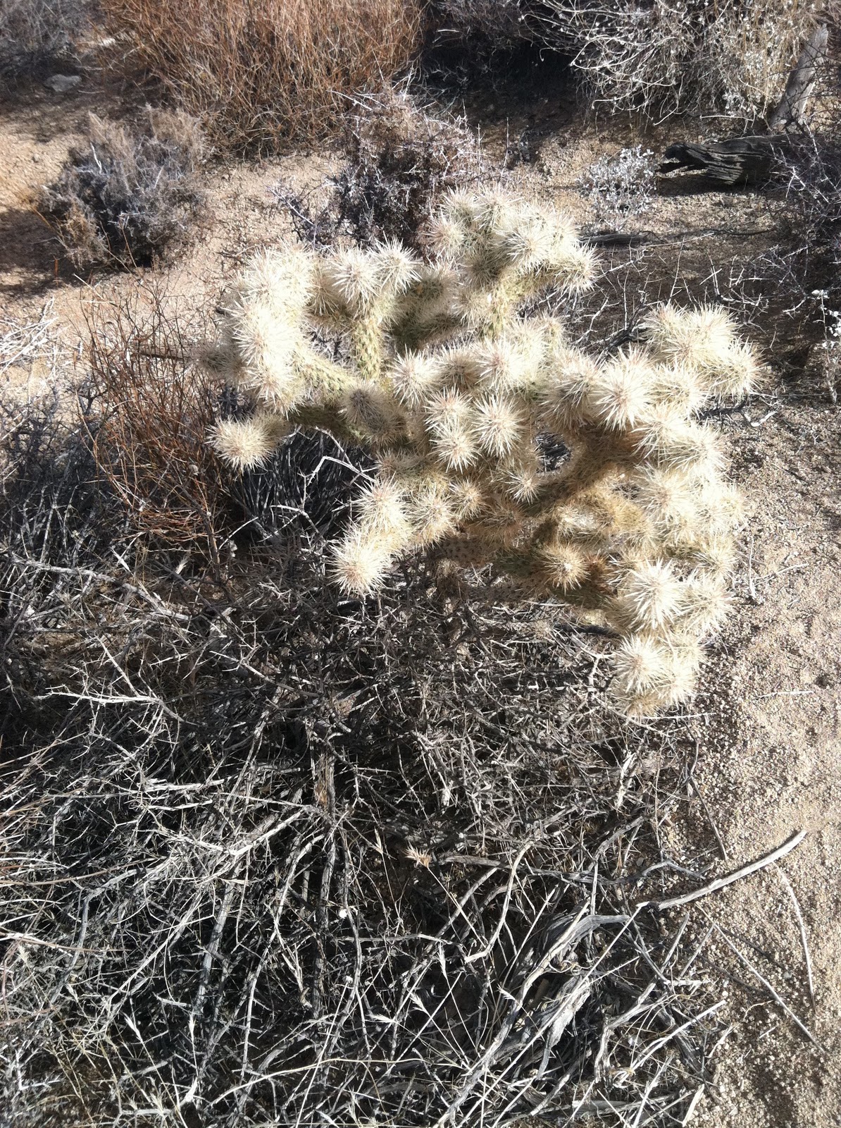
The Mojave Desert.  It's the driest place in North America, and is the site of the highest recorded temperature as well.  Conditions are harsh, with huge extremes in temperature and blustery winds.  This place is brutal.  So, it makes sense that the colors of the place are bleached and muted.  Vivid colors don't stand a chance in this environment.  But, there is a great beauty and nuance in these soft hues, as these photos taken at Joshua Tree prove.


Sunday, January 15, 2012

Color A Day #14 - Golden Monzogranite

 Joshua Tree National Park is an inspiring spot.  It's a place full of a great variety of textures; prickly cactus, rough stone, sandy foot-paths, spiked succulents, and weathered wood.  The monzogranite rock formations of this place are simply stunning.  But the colors of the place are strikingly muted: greys, browns, tans, taupes, silvers, and golds.  These neutrals combine together to form a warm golden tan, strikingly juxtaposed by a brilliant blue sky.


Saturday, January 14, 2012

Color A Day #13 - Joshua Tree Green

I had the opportunity to make a brief visit to Joshua Tree National Park this weekend.  It's hard not to be inspired by this place...so full of stark beauty.    Great, old Joshua Trees dot the landscape adding touches of soft green to an otherwise muted palette of neutral tans and browns.   I'm inspired today by this silvery, yellow-tinged green.  Joshua Trees makes such a living statement against the desert tan-scape as they reach their green spiked arms up into to cobalt sky.